The Little Boho Bookshop
Designing a responsive ecommerce website
Background
The Little Boho Bookshop is an independent bookstore located in Bayonne, NJ. Opened on July 31, 2017, the bookshop is a cozy getaway spot where you can relax, discover new reads and find your happy place.They are focused on community; bringing events, books, and conversation to the downtown area.
Problem Statement:
The Little Boho Bookshop has a strong digital presence on social media, but their current website doesn’t reflect that because it is outdated and difficult to navigate.
Solution:
Redesign the website to showcase the bookshops unique services, highlight their upcoming events, and sell books & gifts online to their loyal customers. Improve the information architecture to simplify navigation and create an easier way for users to register for events.
Project Details
Role
UX Researcher & Designer, UI Designer
Tools
Figma, Sketch, Miro, Whimsical, Zoom, OptimalSort
01. Research
In order to understand how & why users shopped online for books, I conducted secondary research, including market research & competitive analysis as well as user research, including user interviews with contextual inquiry.
Design Objectives
Redesign a responsive website for The Little Boho Bookshop
Improve navigation & information architecture
Extend coherent branding that aligns with the shop’s current customer experience
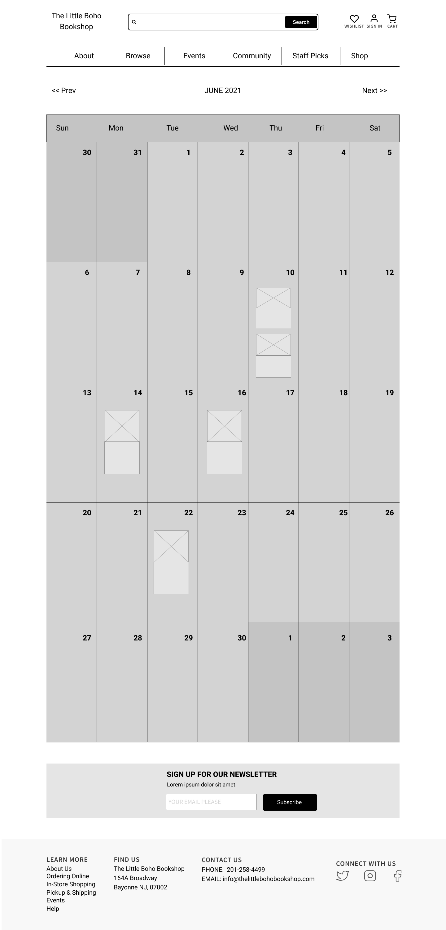
Improve the event calendar and registration experience
Research Goals
Understand the competition in the book industry
Understand what motivates customers to visit a local bookstore’s website
Identify how users register for events online
Identify how users sign up for membership services, such as book clubs or loyalty programs
Market Research + Industry Trends
I started by researching the independent bookstore industry, to better understand the trends, history, pain points, and what makes them successful.
Indie booksellers compete on customer experience, not price or inventory
Indie bookstores appeal to the growing number of consumers who care more about supporting local businesses than price
Retailers must build their community in both the real world and digitally to build an online community on social media
Competitive Analysis
Once I understood the landscape of the industry, I identified 5 competitors including 3 global e-commerce retailers and 2 independent bookstores in the local area that all do something different well.
I discovered big-box retailers are the biggest competition for independent booksellers, and found that they lack the community feel & don’t offer personal curation
Using these insights, I determined the Product Requirements that would help The Little Boho Bookshop stand out among the competition were:
Provide Staff Picks & Recommendations
Include Membership Information so users can sign up for newsletters to find out about upcoming events
Include a ‘Know Before You Go’ section on events page: so users know what to expect at the event
Site Visit
I visited The Little Boho Bookshop, in order to gain a first hand experience of shopping at the store. While there, I was able to interact with the staff, make a purchase, observe other customers, and take some photos of the shop setup for reference.
Displays featuring kids books & toys, gifts for Mother’s Day, and a Young Adult section.
Key Insights
-
Add a Book Request Form
Customers can call the store & request a custom order for books - adding a Book Request Form would give customers access to items that are not available on the website or in store.
-
Organize Books by Age
The store has all books organized by reader’s age, this should translate to the website by including categories in the navigation menu like Books for Kids, Books for Young Adults, Books for Adults.
-
Include Book Preview Pages
Being able to flip through the pages of books in a store is something that’s missing when shopping online - including book preview pages will allow customers to have a similar experience when browsing for books on the site.
-
Include Staff Picks Section
Staff members are very helpful at finding specific books or making recommendations for customers, including a staff picks page or section would add a personal touch and deep level of curation.
User Research Insights
The next step was to talk to potential users to understand their pains & goals in order to empathize with them. I conducted 4 user interviews with contextual inquiry to gain insights into users book shopping preferences, experience with book related events & book clubs and observe how they completed a series of tasks on the current website & a website they typically use.
Most important features: Search, Related books, reviews (author & peers), Cost, Image of book
All participants check multiple sites, including the library, to compare pricing before purchasing books
Including images & detailed descriptions of events is important for participants when deciding whether or not to attend
Clearly defined categories to choose from in the navigation menu is important
Book recommendations & staff suggestions are appreciated by customers
Persona
Based on research, I created the persona Katie, an avid reader who loves discovering new books. As a socially conscious consumer, she is always looking for ways to support local businesses and connect with others in the community who share similar interests.
Story Board
Once I determined who the average user was, I thought about the functionality I wanted to highlight in my design and created a storyboard around registering for an event and purchasing a book.
02. Define
After completing my research, I moved on to defining the problems with the bookstores’ current website. I created an actionable problem statement to sum up Katie’s needs, and came up with some How Might We questions to reframe the design challenges and explore new ideas and solutions.
Point of View Statement:
Katie needs to easily register for events & purchase books online from her local bookshop because she wants to get involved with the community and support a local business.
How Might We Questions:
How might we update the bookshops website to accommodate the shift to online channels for book purchasing?
How might we create an events calendar that showcases upcoming events and book club meetings and allows online registration?
How might we recreate the personalized experience customers have when purchasing a book in store, online?
Card Sort + Site Map
In order to determine how participants naturally organize items found on The Little Boho Bookshop’s website, I conducted a card sorting exercise online. Participants, categorized 50 book store related items & created labels for each category they created.
Key Findings:
Overall participants were in agreeance about the general types of categories they created, but varied on which cards were included under each, so standardizing the categories was a challenge
All 9 participants included a category about the store, events, merchandise, & books
The bookshop’s website had 12 categories in the navigation menu, and I was able to reduce it down to 6 based on the most common categories created by participants who completed the card sort.
These categories included: About, Books, Events, Merch, Sale
03. Design
User Flow
I thought about how Katie would use the site and created user flows for two scenarios, purchasing a book & buying tickets for an event. I outlined all possible paths Katie would take as she moved through the site to complete each task.
Responsive Wireframes
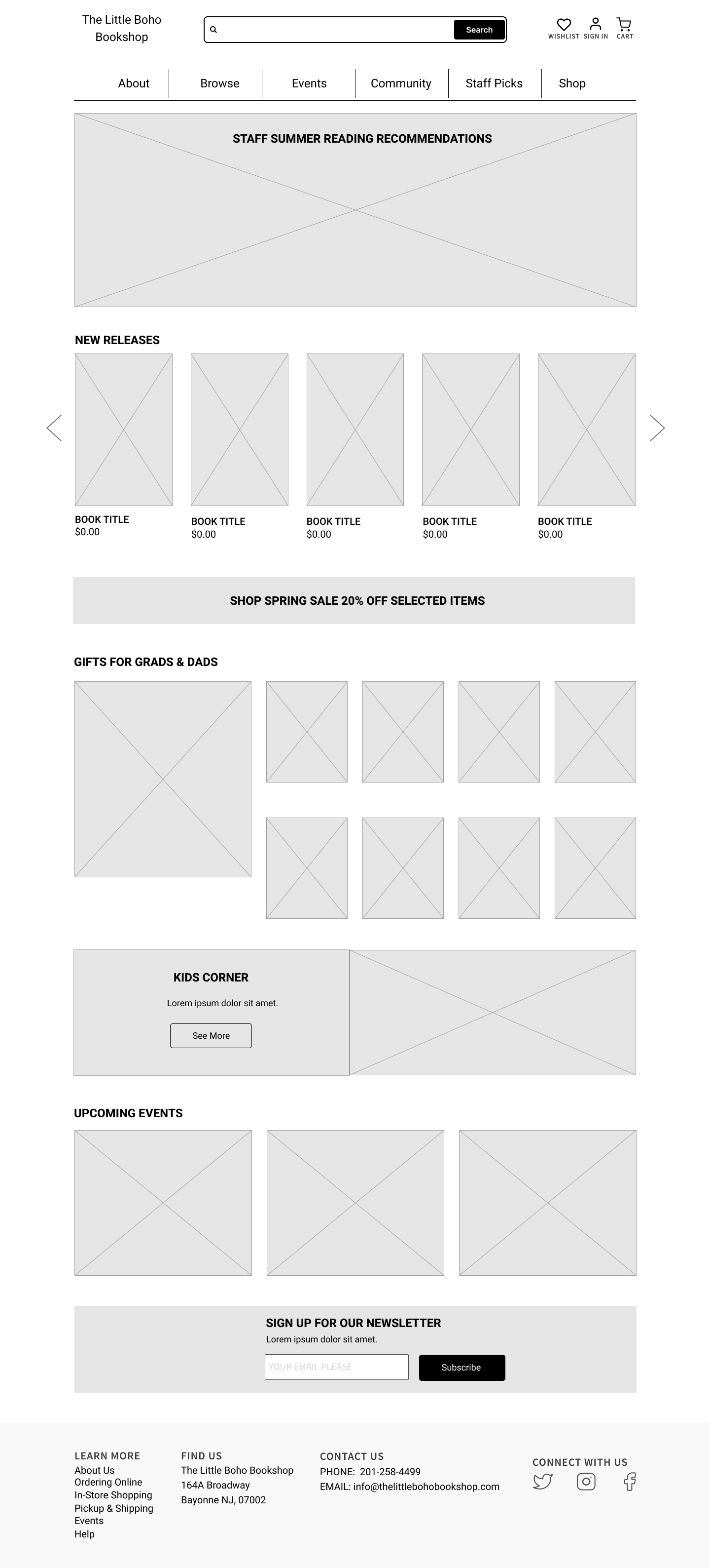
Using my sketches as a starting point & referencing my user flow as a guide to make sure I was taking into account all actions & decisions Katie would make and the pages she would encounter I created my mid-fidelity wireframes in Figma.
From the sketch phase to wireframing a few key changes were made, including:
Combining layouts of sections from all 3 sketches
Prioritizing staff recommendations & new releases sections
Including a newsletter signup section on all pages


UI Designs
I refreshed the existing branding elements to make the website look & feel as warm and inviting as the store. I applied the UI elements to the desktop version for each of my 5 screens first and then translated my designs to the mobile versions as well.
Homepage
Event Details Page
Browse Books Page
Product Page
04. Test
Prototype + Usability Test
After creating the prototype, I conducted four 1-on-1 usability tests of the desktop version of The Little Boho Bookshop website to study how users responded & interacted with the site. All tests were conducted remotely via Zoom using a mid-high fidelity Figma prototype.
Findings
All users described the site as easy to use, easy to understand, & easy to navigate
Users took a variety of paths to get to the product details page including via navigation menu & new releases section
All users were able to add a product to their shopping cart
All users were able to find an event; they either used the upcoming events section or the navigation menu
All users were able to add en event to their shopping cart
Users were expecting different interactions with the event calendar & new releases page
Next Steps
After synthesizing the data from the usability test, I was able to start seeing patterns in the areas participants had success or difficulty with. Once I identified the most common pain points, I came up with potential solutions that I would focus on as the next steps for priority revisions.
Event Calendar:
Make image & event description clickable in the event calendar so participants have another way to get to the event details page
Include a link on hover over the event title in event pop up so participants are aware it’s a clickable box
Rewrite copy in event pop up so participants see that they must purchase tickets to register for the event
New Releases Page:
Include subcategories on new releases page (ex. fiction, kids, staff recommendations) to give participants more direction & context
Increase the page title font size so it’s clear what page the user is on
Reflections
The insights uncovered during the site visit were really important in understanding the business goals, shaping the redesign, and determining what features to include.
Card sorting was a helpful exercise for defining and updating the categories in the navigation menu


